About the design
Imitation is the sincerest form of flattery. From the very beginning, I knew I wanted to make Dee Goong An, part 2 (DGA2) as similar to the original Dee Goong An as humanly possible. They would have the same dimensions so that they would look good next to each other in a bookcase.
Page layout
Here are two pages side by side. On the left you see the first page of the last chapter of the original Dee Goong An, on the right the first page of DGA2.
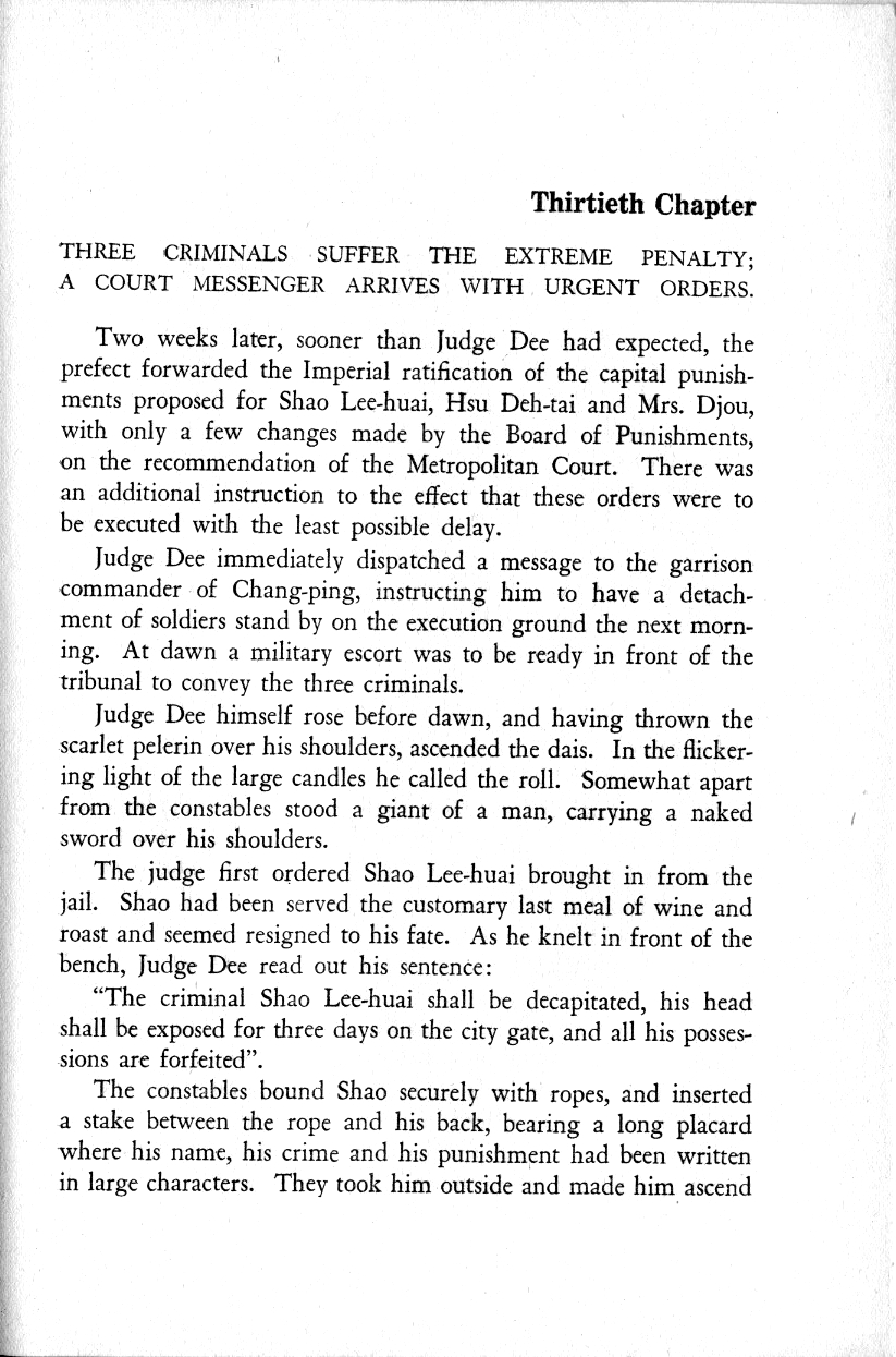
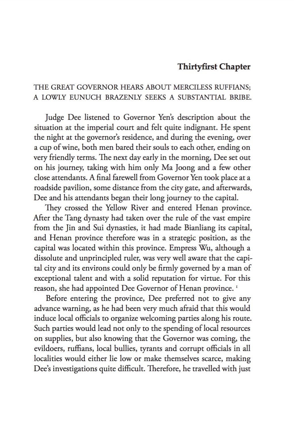
Van Gulik had his own little ways: chapter numbers written out in text, a chapter title consisting of two fully justified lines that have a similar structure, and indenting the first line (which no modern typographer would do).
Back cover & spine
 The back cover of Dee Goong An shows a beautiful calligraphy.
I knew I wanted something similar for the back cover of DGA2.
As it happened, I was contacted some time ago by a Chinese student called Ruoxi Zhang
who was interested in Van Gulik and would like to see my collection.
She proved to be a very talented calligrapher, so I took my chance
and asked her if she would be willing to provide me with calligraphies of
the titel and subtitle of DGA2. I was very happy when she agreed.
She even didn't complain when I asked her to do the subtitle again,
since the first one had been vetoed by Piet Rombouts who came up with a radically different one.
The back cover of Dee Goong An shows a beautiful calligraphy.
I knew I wanted something similar for the back cover of DGA2.
As it happened, I was contacted some time ago by a Chinese student called Ruoxi Zhang
who was interested in Van Gulik and would like to see my collection.
She proved to be a very talented calligrapher, so I took my chance
and asked her if she would be willing to provide me with calligraphies of
the titel and subtitle of DGA2. I was very happy when she agreed.
She even didn't complain when I asked her to do the subtitle again,
since the first one had been vetoed by Piet Rombouts who came up with a radically different one.
Front cover
 The hardest part proved to be the front cover design.
At first, I thought about using a wood-cut, just like Van Gulik.
But I soon realised that idea was going nowhere.
How would I obtain such a wood-cut?
I certainly couldn't make it myself, like Van Gulik had done.
So I reconsidered: in DGA2 Judge Dee has become Governor Dee.
The wood-cut was perfect for Judge Dee, it shows him in all his judicial glory.
But Governor Dee is a high-ranking official at the court of the Empress, his role is quite different.
So why not let the cover reflect that?
The hardest part proved to be the front cover design.
At first, I thought about using a wood-cut, just like Van Gulik.
But I soon realised that idea was going nowhere.
How would I obtain such a wood-cut?
I certainly couldn't make it myself, like Van Gulik had done.
So I reconsidered: in DGA2 Judge Dee has become Governor Dee.
The wood-cut was perfect for Judge Dee, it shows him in all his judicial glory.
But Governor Dee is a high-ranking official at the court of the Empress, his role is quite different.
So why not let the cover reflect that?
 Then I remembered the image of Dee Renjie, Duke of Liang, that Van Gulik used opposite the French title page.
It doesn't quite fit in with the rest of the book, but it provided me with a valuable idea.
It has a gold-coloured background.
Then it struck me: what if I turned the colours around for the cover: gold on black?
The gold would resonate nicely with the image Van Gulik used and with Governor Dee’s lofty position at court.
And the black background would correspond with that of the original.
Then I remembered the image of Dee Renjie, Duke of Liang, that Van Gulik used opposite the French title page.
It doesn't quite fit in with the rest of the book, but it provided me with a valuable idea.
It has a gold-coloured background.
Then it struck me: what if I turned the colours around for the cover: gold on black?
The gold would resonate nicely with the image Van Gulik used and with Governor Dee’s lofty position at court.
And the black background would correspond with that of the original.
 Initially, I tried just using the same image, but that didn't work somehow.
Then I happened to look at the Wikipedia entry for Judge Dee and saw this image.
I liked it.
So I started fiddling around with it, but the quality of the available versions on the internet was just nog good enough.
Luckily, Piet Rombouts knew the origins of the image and was able to make a much better scan
from a copy in the Leiden University Library. The rest is history.
Initially, I tried just using the same image, but that didn't work somehow.
Then I happened to look at the Wikipedia entry for Judge Dee and saw this image.
I liked it.
So I started fiddling around with it, but the quality of the available versions on the internet was just nog good enough.
Luckily, Piet Rombouts knew the origins of the image and was able to make a much better scan
from a copy in the Leiden University Library. The rest is history.
